Posts

Showing posts from April, 2018

Evaluation question 4

Image
How did you use media technologies in the construction and research, planning and evaluation stages?

Evaluation question 3

Image
What have you learned from your audience feedback? I found audience feedback to be a consistent element in which I always received, to ensure I was meeting my target audience needs fully, these often included more than just one method. This was not just gained for that of my music video but also both of my ancillary products as well, therefore gaining audience feedback on all areas of my final products. Due to receiving this, it gave me inspiration on how to change and tweak elements within my products to better fit the needs, and make them more appealing the target audience. The participants used within these feedback sessions varied between the ages of 17-34, mainly consisting of females (with the odd male making an appearance), this age range included both my targeted audience age, as well as those outside of this targeted age range. Initial ideas; Pitch. The pitch of my three initial narrative ideas was presented to a focus group of males and females between the ages of 17-1...

Evaluation question 2

How effective is the combination of your main product and ancillary texts? Eval question 2 from nikkinoodlebowl

Evaluation question 1

in what ways do your media products, use develop or challenge forms and conventions of real life media products?

Magazine advert; Audience feedback

Image
After completing the first draft of my magazine advert, I asked some of my peers and others their opinion on the first draft of my magazine advert. I collected this through the use of an interview type method in which I asked different people, one to one what they liked about the advert, and what could be improved. I then put these comments into a table as they were talking. Screenshot of the first draft shown to the members giving feedback. Table of feedback given

Magazine advert; First draft

Image
This is a screenshot of my first draft of my Magazine advertisement. I will then be showing this to a group of individuals to receive their feedback (both positive and negative) to see if there is anything that could be improved. However this is in fact my first draft.

Magazine advert; Spotify logo

Image
I figured that the magazine advert looked a little bare in the bottom right hand corner, therefore I needed something to add in here, to liven the magazine up. It was suggested to me by one of my peers that I add the Spotify logo and put, 'now available on' just before the logo. However instead of having it in black and white like the other social media logos, I thought it would add more of a pop of colour to the advert if the logo was the signature green, yet only subtly as the logo is smaller in scale compared to that of the rest of the information presented. I took the image below from google, of the Spotify logo to use within the magazine advert. Then later added the 'also available on' using the same 'Arial' font from photoshop that was used for the information about the tracks. Therefore meaning I ended up with the magazine advert you can see below.

Magazine advert; Social media logos

Image
This is a Prezi explaining how and why I chose these particular social media logos. Below is the image of my magazine advert, including the social media logos.

Magazine advert; Text

Image
Using my rough plan I made earlier on in the process, this gave me a guide as to where I was placing my text. Meaning I was not aimlessly placing text in random places within the advert, I had a vague idea of where they would go. To start with I wanted the words 'Debut album out now' in bold font, running along the top of the black half of the background. This is due to the fact that it is a vital piece of information to be featured within the advert. Also by having this, it conforms to the conventions of previous magazine adverts I have researched and looked into. The reason for having it in a bold font, in capitals is to make it stand out against the other text. To fulfil my criteria of bold and capital, the font I used was from photoshop itself and was simply called 'Arial black'. Following this I added in ratings from other music magazines, in order to complete this to the full effect, a star rating is often used within real magazine adverts. By having these ...

Magazine advert; Album title

Image
After adding the title of the band, I then added in the name of the album itself. As shown in the above image, this is the name 'Silhouette', it has been placed in a very similar position to that of the album name on my digipak, being on the shoulder of the model. This is also in the same exact font that is used within my digipak, again to reflect a signature.

Magazine advert; Title

Image
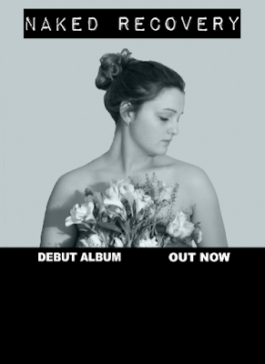
The first thing I did, after creating the background with the image of the model was, that I then imported the same title used on my digipak front cover- as shown below. However almost instantly after importing this, and having it on the magazine advert with the other elements, such as the background and image of the model. I then realised that this particular title did not match the vintage type look that I wished to create. Due to this I had to experiment with some of the other fonts I had chosen as potential ideas in a previous blog post. This lead me to the conclusion that the font shown above, looked the most desirable. Therefore this is the font I ended up using within my magazine advert. Due to having to use a different font within my magazine advert this then meant that I had to also change it on my digipak front cover, to keep consistency between the products. This is the magazine advert with the title included, and showcased with the background and image of the mo...

Magazine advert; Image and background

Image
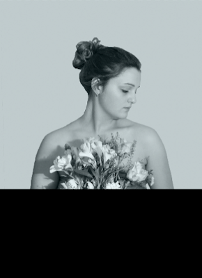
This is the three images combined to create the final 'background' element of the magazine advert. To create this I simply used the 'quick selection tool' to select only the outline of the model, as this is the only element of the image I wished to use. I then used Command J to create a copy of this layer after selecting the outline of the model, and deleted the original layer to then just end up with the model. Therefore deleting the background of the original image.                                                                                                                                                   ...

Magazine advert planning; Image and background

Image
As shown within my digipak planning, I took various images of the model, in different positions. This is the chosen image for my magazine advert. The reason for choosing this particular image is due to the fact that, it matches the simplicity of the digipak image, as well as using the same model, and silhouette idea (to reflect the album title). The fact that she is holding the flowers further promotes the naturalistic element that ties together the digipak and the magazine cover. This is the colour swatch that will be used as the only colour element within the magazine advert, used as the background for the top half of the advert. The fact that I have chosen to use this colour is due to the fact that it is subtle and not too overbearing, linked to the fact that this colour has been used consistently throughout the entirety of my digipak. To contrast this, the use of the colour black will also be featured, yet within the bottom half of the magazine advert. In turn t...

Magazine advert planning; (initial idea)

Image
With regards to my magazine cover, I want it to match the same theme and aura as that of my digipak cover. This is due to the fact that it will create a uniform effect, reflecting that of real life magazine adverts matching their respective digipak. I thought that by drawing this design out, it would give me a more visual aid, with regards to a reference point when creating this advert. As shown above I have planned out the general positioning of where each element of the magazine advert will be placed, as this is only a rough plan this is subject to change. The same colour of the light blue, used on both the CD and the digipak cover itself to heighten this idea of consistency. With regards to information featured, the primary focus is on that of the band name. However, as this is in fact a magazine advertisement, additional information about the release, songs and media platforms it is available on. This will be to correctly inform the audience, in what they are potentially purcha...

Non-genre specific research (magazine advert)

Image
 Kings of leon is an american rock band forming in Nashville Tennessee, in 1999. They achieved initial success in the United Kingdom, with nine top 40 singles and two Brit awards in 2008, following the release of their album only by the night released earlier that year. Their most popular among these songs are 'sex is on fire', 'use somebody' and 'notion'. The reason for choosing this particular magazine cover is due to the fact that, it is completely opposing in almost all aspects, compared to my genre. Within this magazine advertisement it seems to be quite busy with regards to the general design. However there does appear to be a consistent theme flowing throughout the design, this being of a distorted, recording design. The small crosses, the red dot in the top left hand corner and the font all give the implication that it comes across as a recording. Paired with this very digital looking font- almost like an alarm clock gives a very futuristic aura, thi...

Genre specific research (magazine advert)

Image
You me at six are an alternative rock band, forming in 2004, their third album peaked at number three on the UK charts. I thought it would be a good idea to research this band in particular, due to the fact that they are the same genre as my music video. Along with the fact that they use naturalistic imagery as a consistent theme within this album. The colour scheme used within this magazine advert is kept very minimal, using the warm orange sun to break up the darker blues and browns, creating a calming ambience, representing nature. This is accompanied by a white coloured text, featuring both a serif and san serif font. Standing out against this background, enabling the audience to read the band name clearly, in conjunction with this, this further links with the relaxed effect. If a black text were used, not only would the audience find it difficult to read, a darker text presents harsher connotations as opposed to the white that has been used. The image itself that has been...

Magazine research

Image
What is a music magazine? A music magazine is a specific magazine dedicated to music and music culture. They will typically include information about bands or singers that are producing new music, along with exclusive interviews or photo shoots. Its purpose serves to inform and update readers either on a specific type of music or just upcoming music in general. What does a music magazine usually contain? The type of information found within music magazines will be elements such as articles, reviews and general information surrounding upcoming music or chart music. However often music is not the only subject matter that will be found within these specific music based magazines,for example interviews with band artists are a frequent occurrence featuring within these particular magazines. These exclusive interviews then pose as an added feature to engage the readers and urge them to buy the magazine. Design Name- The name of the magazine itself is often short and catchy,this ...

Digipak template

Image
This is a basic digipak template, taken from google. It shows all of the necessary measurements required of the images showcased on the digipak itself, making sure to give accurate lines indicating elements such as the trim line, showing me exactly where everything needs to be placed. This template in particular also gives the measurements of the spine and where the tray goes.

Digipak; Finished (inside cover)

Image
This is the finished design of the inside cover of my Digipak.

Digipak; Inside cover changes

Image
After placing the inside cover of my digipak that I had made next to the other three elements in word, I decided that it did not look as consistent as the other three as you can see it almost looked out of place. Therefore I made the decision to change my design. I wished to keep the basic elements, such as the background and the outline of the flowers but needed to tweak some of the other features. I began by experimenting with colour (using the two colour swatches I have previously used).  This experimentation involved me filling in random flowers using these two colours and the fill tool in photoshop, keeping the blue in the bottom right corner and the grey-beige in the top left corner, leaving me with the image below. I still thought that i needed to change something else, because the design was sill inconsistent in comparison to the other aspects of my digipak, leading me to then change the font. I decided to use the bold font featured on the back cover of my digip...