Magazine advert; Text
Using my rough plan I made earlier on in the process, this gave me a guide as to where I was placing my text. Meaning I was not aimlessly placing text in random places within the advert, I had a vague idea of where they would go.
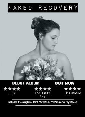
To start with I wanted the words 'Debut album out now' in bold font, running along the top of the black half of the background. This is due to the fact that it is a vital piece of information to be featured within the advert. Also by having this, it conforms to the conventions of previous magazine adverts I have researched and looked into. The reason for having it in a bold font, in capitals is to make it stand out against the other text.
To fulfil my criteria of bold and capital, the font I used was from photoshop itself and was simply called 'Arial black'.

Following this I added in ratings from other music magazines, in order to complete this to the full effect, a star rating is often used within real magazine adverts. By having these it gives the album a good reputation. To complete this rating system, I took a screenshot of four white stars on a black background and used these as the rating system.

This is then what the magazine looked like with the stars then added.

To accompany the stars, with regards to the rating system, the magazine that gave the rating would need to be situated underneath their respective rating. Therefore I looked up three music magazines that are relevant to my particular genre- indie/singer songwriter. To add these magazine names, I again used a font from photoshop called 'Source code variable', this is to give a variation in font, but not to make it look unprofessional, and then placed them in the arrangement below.

As shown in my rough plan, I also wanted to have information about tracks included, enclosed between two white lines to break up the text, and also stick to this vintage type theme. To do this I drew in two line shapes, directly from photoshop, and just increased the thickness to my preferred size.

The reason I added these two lined was due to the fact that I wanted to include the information about the singles included within the album, enclosed between these two lines. To mirror the font used for the 'debut album out now' I used the font 'Arial', yet I did not use all capitals and I also did not use the bold effect. This then differentiates between the music magazine font and the 'debut album' font, but still looking professional as the same font is used multiple times.
To start with I wanted the words 'Debut album out now' in bold font, running along the top of the black half of the background. This is due to the fact that it is a vital piece of information to be featured within the advert. Also by having this, it conforms to the conventions of previous magazine adverts I have researched and looked into. The reason for having it in a bold font, in capitals is to make it stand out against the other text.
To fulfil my criteria of bold and capital, the font I used was from photoshop itself and was simply called 'Arial black'.

Following this I added in ratings from other music magazines, in order to complete this to the full effect, a star rating is often used within real magazine adverts. By having these it gives the album a good reputation. To complete this rating system, I took a screenshot of four white stars on a black background and used these as the rating system.

This is then what the magazine looked like with the stars then added.

To accompany the stars, with regards to the rating system, the magazine that gave the rating would need to be situated underneath their respective rating. Therefore I looked up three music magazines that are relevant to my particular genre- indie/singer songwriter. To add these magazine names, I again used a font from photoshop called 'Source code variable', this is to give a variation in font, but not to make it look unprofessional, and then placed them in the arrangement below.

As shown in my rough plan, I also wanted to have information about tracks included, enclosed between two white lines to break up the text, and also stick to this vintage type theme. To do this I drew in two line shapes, directly from photoshop, and just increased the thickness to my preferred size.

The reason I added these two lined was due to the fact that I wanted to include the information about the singles included within the album, enclosed between these two lines. To mirror the font used for the 'debut album out now' I used the font 'Arial', yet I did not use all capitals and I also did not use the bold effect. This then differentiates between the music magazine font and the 'debut album' font, but still looking professional as the same font is used multiple times.

Comments
Post a Comment